
The Brittle Component Trap
Building reusable UI components should streamline development. Instead, many teams find themselves wrestling with libraries that quickly become unmanageable. The common symptom? A proliferation of boolean props like hasBadge, isCompact, and withIcon. This isn't a sign of poor planning, but a fundamental misunderstanding of how components should be designed. The real issue lies in treating components as rigid, monolithic entities rather than flexible composition primitives.
Consider a scenario where you've built a set of modular landing page cards. Initially, they are clean and reusable. But the moment a new layout requirement emerges—shifting an image, adding a secondary action—developers are forced to modify the core component. This approach risks introducing regressions across the entire application, turning a once-useful module into a "brittle spaghetti monster." Every tiny structural tweak demands a deep dive into the component's internals, increasing the surface area for bugs.
The underlying problem isn't the complexity of the UI itself, but the API design of the components. When a component's interface is a flat list of boolean flags, it signals that the component is trying to handle too many variations internally. This is like trying to build a single tool that can hammer nails, saw wood, and paint walls – it ends up doing all three poorly. A better approach involves deconstructing the component into its constituent parts and allowing for more granular composition.
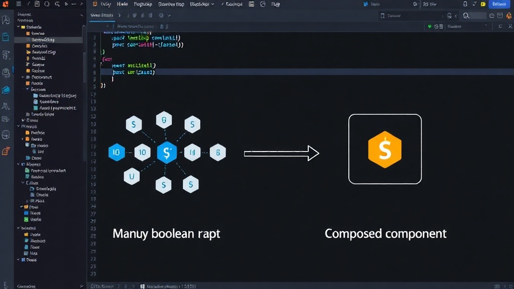
The Pitfalls of Boolean Prop Overload
A component API that relies heavily on boolean flags is a clear indicator of a design flaw. Each boolean prop represents a specific feature or variation that the component must conditionally render or style. As requirements grow, so does the prop list. This leads to:
- Increased Complexity: The component's internal logic becomes convoluted, making it difficult to understand, debug, and maintain.
- Reduced Reusability: A component overloaded with specific flags is less adaptable to new contexts. It's tailored for a narrow set of use cases.
- Higher Risk of Regressions: Modifying one flag can have unintended consequences on other parts of the component, especially if the logic is intertwined.
- Poor Developer Experience: Developers consuming the component must remember and correctly set numerous flags, leading to errors and frustration.
This pattern often emerges when developers try to build a "one-size-fits-all" component. They anticipate every possible variation and bake it into the component's API. However, software requirements are rarely static. The moment a new, unforeseen variation arises, the component's API must be extended, perpetuating the cycle of complexity.
Composition Over Configuration: The Primitives Approach
The solution lies in shifting from configuration-heavy, monolithic components to a system of smaller, more focused composition primitives. Instead of one component managing multiple states and layouts via props, break it down into smaller, independent pieces that can be assembled as needed. This mirrors how successful design systems operate.
Consider the landing page card example. Instead of a single Card component with props like hasImage, imagePosition='top' | 'side', hasBadge, hasSecondaryAction, we can decompose it:
CardContainer: Provides basic structural styling and layout.CardHeader,CardBody,CardFooter: Define distinct content areas.CardImage: Handles image display, with its own props for source, alt text, etc.CardBadge: A dedicated badge component.CardAction: A dedicated action button/link component.
With this approach, developers assemble the card by composing these primitives. To add an image, they include <CardImage />. To position it, they might arrange CardImage and CardBody within CardContainer using layout primitives or CSS. This makes the API explicit and the composition flexible.
This pattern is akin to building with LEGO bricks. Each brick is a simple primitive with a well-defined interface (the studs and sockets). You can combine them in countless ways to build complex structures, and adding a new piece or rearranging existing ones is straightforward without breaking the entire model.
Implementing Compositional APIs
Adopting a compositional approach requires a shift in mindset and development practices. Here’s how to implement it:
- Identify Core Primitives: Analyze existing monolithic components. What are their fundamental building blocks? Extract these into standalone, highly focused components.
- Define Clear Contracts: Each primitive should have a simple, predictable API. Avoid boolean flags where possible; prefer dedicated components or more descriptive props.
- Leverage Slots or Children: Use props like
childrenor dedicated slot props (e.g.,headerContent,bodyContent) to allow consumers to inject arbitrary content and structure. This is far more flexible than prop drilling or conditional rendering within the component. - Provide Layout Helpers: While primitives should be focused, offer accompanying layout components or utilities to simplify the assembly process. This could be simple flexbox or grid wrappers.
- Document Composition Patterns: Clearly document how primitives can be combined to achieve common UI patterns. Provide examples of typical compositions.
For instance, instead of passing a complex object to configure a button's appearance, create separate components like PrimaryButton, SecondaryButton, DestructiveButton, or allow passing children to a generic Button component that accepts variants. The key is to make the API reflect the structure and intent of the UI, rather than a series of configuration options.
The Long-Term Benefits
This compositional strategy yields significant long-term advantages. Components become:
- More Maintainable: Changes to one primitive have minimal impact on others. Debugging is localized.
- More Extensible: New variations can be created by composing existing primitives in novel ways, rather than modifying core components.
- Easier to Understand: The explicit nature of composition makes the UI structure transparent.
- More Robust: Reduced complexity and fewer conditional paths lead to fewer bugs.
By treating components as composition primitives with clear, focused APIs, developers can escape the cycle of brittle, unmanageable UI libraries. This shift ensures that reusable components remain a source of efficiency, not a constant headache.