The Unseen Complexity of OTP Inputs
One-time-password (OTP) inputs, ubiquitous in modern authentication flows, appear deceptively simple. Yet, building a robust and user-friendly OTP component involves navigating a surprisingly complex web of interactions. This is precisely the scenario presented by the latest challenge from ReactChallenges.com, pushing developers to implement features that go far beyond just displaying six input fields.
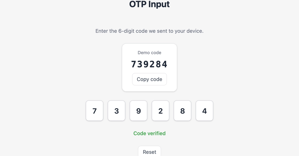
The core task is to construct a six-field OTP input component in React. This isn't just about rendering a series of text boxes; it's about orchestrating a dynamic user experience. The component must automatically manage focus, intelligently handle user input, and provide feedback through validation against a predefined demo code. For developers accustomed to simpler form elements, this challenge highlights the subtle but critical details that elevate a basic UI element into a polished feature.
Core Requirements for a Seamless Experience
The challenge outlines a set of specific requirements designed to mimic the behavior of production-ready OTP inputs. These include:
- Six Individual Inputs: The component must render precisely six single-character input fields, each intended to hold one digit of the OTP.
- Initial Focus: Upon the component's first render, the focus must be automatically set to the first input field, ready for immediate user input.
- Typing and Advancing: When a user types a digit, it should populate the currently focused input field. Crucially, focus must then automatically advance to the next input field in sequence. This creates a smooth, sequential data entry experience.
- Input Sanitization: The component should only accept numeric characters. Any non-numeric input should be ignored, preventing invalid characters from disrupting the OTP.
- Backspace Behavior (Current Field): If the user presses the Backspace key while in an input field that already contains a digit, that digit should be cleared. The focus should remain on the current field, allowing the user to correct it directly.
- Backspace Behavior (Empty Field): If the user presses Backspace while in an input field that is currently empty, the component should clear the digit in the previous input field and move the focus back to that preceding field. This enables efficient correction of previously entered digits.
- Keyboard Navigation: Support for keyboard navigation, specifically the Left Arrow key (ArrowLeft), is required to allow manual movement of focus to the previous field. This complements the automatic advancement and backspace functionality with manual control.
These requirements, when implemented correctly, contribute to an OTP input that feels intuitive and forgiving. It anticipates user actions, guiding them through the input process with minimal friction.
Beyond Basic Input: Paste Handling and Validation
The challenge doesn't stop at basic typing and navigation. Two more advanced features are key to a production-grade OTP component:
Intelligent Paste Handling
A significant usability enhancement is the ability to paste an entire OTP code into the component. The challenge requires the component to intelligently handle this. When a user pastes a string of digits (or potentially a string containing digits and other characters), the component should:
- Extract the numeric digits from the pasted string.
- Populate the input fields sequentially with these digits.
- Advance focus accordingly.
- If the pasted string is longer than the number of available fields (six in this case), only the first six digits should be used, filling the component completely and potentially moving focus to the field *after* the last one, or simply stopping.
This feature is critical for mobile users who often receive OTPs via SMS and can copy-paste them directly. Implementing this correctly requires careful event handling to capture the paste event and process the clipboard data.
Demo Code Validation
Finally, the component must validate the entered OTP against a predefined 'demo code'. This is essential for testing and demonstrating the component's functionality without requiring a live backend. Upon completion of the OTP entry (i.e., all six fields are filled), the component should compare the entered code with the demo code. The outcome of this comparison—whether the codes match or not—should be clearly indicated to the user, typically through a visual cue or a message.
This validation step transforms the component from a simple data entry form into a functional part of an authentication workflow, even in a simulated environment.
Why This Challenge Matters
Building an OTP input component is more than just an exercise in React state management. It’s a deep dive into user experience design within the constraints of a common UI pattern. Developers are forced to consider:
- Event Handling: Capturing keyboard events (keydown, keyup, paste) and managing their propagation.
- Focus Management: Programmatically controlling which input element has focus, especially across asynchronous operations or complex user interactions.
- State Management: Efficiently updating the state of each individual input field and the overall OTP value.
- Accessibility: Ensuring the component is usable with assistive technologies, though this specific challenge doesn't explicitly detail ARIA attributes, it's a crucial real-world consideration.
- Edge Cases: Handling unexpected inputs, rapid key presses, and different browser behaviors.
The challenge, hosted at reactchallenges.com, provides a clear link to the problem statement and expected outcomes. It serves as a valuable learning opportunity, equipping developers with the skills to implement one of the most common yet surprisingly intricate UI components in web development. Successfully completing this challenge demonstrates a nuanced understanding of front-end development principles and a keen eye for user experience details.