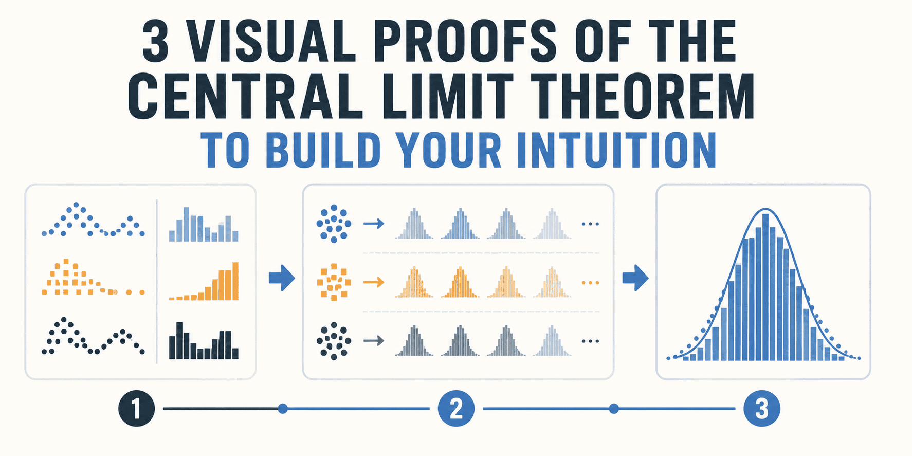
The Ubiquitous Bell Curve: Understanding the Central Limit Theorem
The Central Limit Theorem (CLT) is a cornerstone of statistics, a principle that explains why the bell curve, or normal distribution, appears so frequently in nature and data analysis. At its core, the CLT states that the distribution of sample means will approximate a normal distribution as the sample size becomes larger, regardless of the original population's distribution. This might sound abstract, but its implications are profound, underpinning everything from hypothesis testing to confidence intervals. Instead of relying solely on mathematical proofs, which can be dense and intimidating, we can build a robust intuition for the CLT by examining visual demonstrations of its power.
Proof 1: The Sum of Many Random Variables
Imagine you are rolling a single fair six-sided die. The probability distribution of a single roll is uniform: each number from 1 to 6 has an equal chance (1/6) of appearing. If you were to plot this distribution, it would be a flat line. Now, what happens if you roll two dice and sum their outcomes? The possible sums range from 2 (1+1) to 12 (6+6). The distribution is no longer uniform; sums like 7 become more likely (1+6, 2+5, 3+4, 4+3, 5+2, 6+1 – six combinations), while extreme sums like 2 or 12 are less likely (only one combination each). The distribution starts to bulge in the middle.
Consider rolling three dice and summing them. The distribution of sums becomes even more concentrated around the mean (which would be 3 * 3.5 = 10.5). The tails of the distribution, representing very low or very high sums, become thinner. If you continue this process, rolling ten, twenty, or even a hundred dice and summing their outcomes, the distribution of these sums will increasingly resemble a perfect bell curve. This is because the CLT is essentially about the aggregation of random events. When you add many independent random variables together, their individual variabilities tend to cancel each other out, and the resulting sum's distribution converges towards a normal distribution.
Think of it like this: if you're trying to guess the average height of people in a large city, and you take many small samples, the average height in each sample will cluster around the true average height of the city. Even if the original population had a skewed height distribution (perhaps more people are slightly shorter than average), the distribution of your sample averages will become more symmetrical and bell-shaped as your samples get larger.

Proof 2: The Distribution of Sample Means
This proof is perhaps the most direct illustration of the CLT. Instead of summing random variables, we focus on the distribution of their means. Let's return to our six-sided die. We know the population distribution is uniform. Now, we take a sample of, say, five rolls and calculate the average. We record this average. Then, we take another independent sample of five rolls and calculate its average. We repeat this process thousands of times, each time taking a new sample of five rolls and recording its mean.
If we plot the distribution of these thousands of sample means, we will observe a distinct pattern. The distribution will start to look like a bell curve, even though the original distribution (a single die roll) was flat. The mean of this distribution of sample means will be very close to the mean of the original population (3.5 in the case of a six-sided die). The spread of this distribution, known as the standard error, will be smaller than the standard deviation of the original population, and it will decrease as our sample size (the 'five rolls' in this example) increases.
The surprising detail here is not just that the distribution becomes normal, but that it happens so reliably. It doesn't matter if the original population is uniformly distributed, skewed, or even bimodal. As long as the population has a finite variance and we draw sufficiently large, independent random samples, the distribution of the sample means will approximate a normal distribution. This is the magic that allows statisticians to make inferences about populations from sample data with a high degree of confidence.
Proof 3: The Polya Urn Scheme and Random Walks
A more dynamic way to visualize the CLT involves concepts like random walks and urn schemes. Consider a variation of the Polya urn scheme. Imagine an urn initially containing balls of different colors, say, one black and one white ball. You draw a ball at random, note its color, and then return it to the urn along with another ball of the same color. So, if you draw a white ball, you put it back with an additional white ball, increasing the proportion of white balls for the next draw. If you draw a black ball, you add another black ball.
If you perform this process many times, the proportion of white or black balls in the urn will fluctuate, but the underlying process is designed to demonstrate convergence. A more direct analogy to the CLT can be seen in a simple random walk. Imagine a particle starting at position zero on a number line. At each step, the particle moves either one unit to the right or one unit to the left with equal probability (like flipping a coin). If you track the particle's position after many steps, the distribution of its final positions will tend towards a normal distribution.
This is because each step is an independent random variable (+1 or -1). The final position is the sum of many such independent random steps. As the number of steps increases, the positive and negative movements tend to cancel each other out, leading to a distribution of final positions that is centered around zero and bell-shaped. This visual represents how deviations from the mean tend to average out over many independent random events, a core concept of the CLT.
What nobody has addressed yet is how the visual intuition gained from these proofs translates to more complex, real-world phenomena like the distribution of stock market returns or the spread of diseases, where underlying distributions are far from simple.