The Accessibility Paradox: Green Axe, Invisible Text
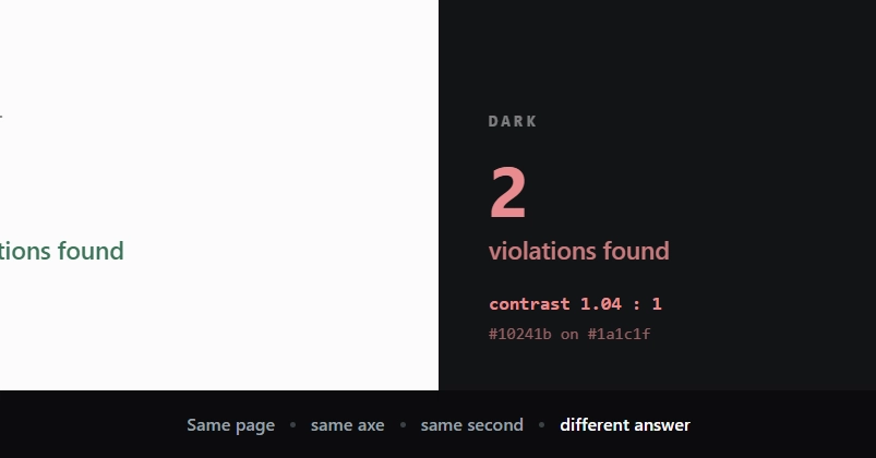
A recent post on dev.to by Henrique Yuri highlighted a critical, yet often overlooked, paradox in web accessibility: a page can pass automated accessibility checks with flying colors, while still presenting fundamentally inaccessible content to users. The author reported a page with zero Axe violations, only to discover that a key button text had a contrast ratio of a mere 1.04:1. This ratio is so low that, for practical purposes, the text is effectively invisible, especially to users with visual impairments.
This situation underscores a common misconception: that a green light from an automated accessibility scanner like Axe is the final word on a page's accessibility. The reality is that automated tools, while invaluable, answer a narrower question than we often assume. They are excellent at detecting specific, programmatic violations but can miss nuanced usability issues that depend on human perception and context.
Deconstructing the Bug: Theme Systems and Contrast Ratios
The root of the problem, as described by Yuri, lay in a common theme system implementation. The system used CSS variables (tokens) defined on :root, which were then overridden within a prefers-color-scheme media query for dark mode. Further overrides were applied via a [data-theme] attribute, allowing for manual theme toggles that took precedence in both light and dark contexts.
Buttons were implemented in two styles: a solid primary button and a bordered secondary button. The issue specifically affected the primary button, where the --accent background color and the color property for the text were set. In the context of the specific theme applied, these values resulted in the abysmal 1.04:1 contrast ratio.
The author's theme system was structured conventionally:
.btn {
  background: var(--accent);
  color: var(--text-on-accent);
}

.btn--secondary {
  background: transparent;
  border: 1px solid var(--accent);
  color: var(--accent);
}
The problem wasn't that the system failed to apply variables or respect media queries. It was that the chosen variable values for a specific theme configuration created an inaccessible contrast. Axe, in this instance, did not flag the contrast ratio as a violation because the specific values used for --accent and --text-on-accent, when calculated, did not fall below the WCAG AA threshold for large text (4.5:1) or standard text (7:1). However, the text was rendered with a color that was practically indistinguishable from the background.
The Limitations of Automated Accessibility Testing
This incident highlights a crucial limitation of automated accessibility tools. Axe, and similar checkers, are designed to detect specific, detectable patterns of failure. They can verify that a color combination meets a certain numerical contrast ratio, that form elements have labels, that images have alt text, and that ARIA attributes are used correctly. However, they cannot understand the semantic intent of the design or the user's perceptual experience in the same way a human can.
Consider the WCAG 2.x contrast ratio guidelines. For normal text (under 18pt or 24px), a ratio of at least 4.5:1 is required. For large text (18pt or 24px and up), the requirement drops to 3:1. The 1.04:1 ratio is so far below even the most lenient threshold that it's effectively invisible. Yet, if the automated checker was configured to look for a specific numerical threshold and the values, while terrible, didn't trigger that threshold based on some obscure interpretation or a misconfiguration, it would pass.
The author's realization was that the Axe run was 'green' because it was answering a simpler question: 'Are there any elements with programmatically detectable accessibility violations based on predefined rules?' It wasn't asking, 'Is this content actually perceivable by a human user?'
Bridging the Gap: Human Oversight in Accessibility
The implication for developers and designers is clear: automated tools are a vital first line of defense, but they are not a substitute for human judgment and comprehensive testing. Relying solely on automated checks is akin to checking if a car's engine light is off without ever test-driving the vehicle.
To ensure true accessibility, a multi-faceted approach is necessary:
- Automated Testing: Integrate tools like Axe into CI/CD pipelines and local development workflows to catch common, programmatic issues early.
- Manual Testing: Regularly conduct manual audits using keyboard navigation, screen readers (like NVDA, JAWS, VoiceOver), and contrast checking tools. This is where nuanced issues, like the 1.04:1 contrast, are caught.
- User Testing: Involve users with disabilities in the testing process. Their lived experience provides invaluable feedback that automated and even manual checks might miss.
- Design System Governance: Establish clear guidelines and review processes for color palettes, typography, and interaction design within design systems to prevent inaccessible combinations from being introduced in the first place. This includes defining minimum contrast ratios for all text elements and ensuring theme configurations adhere to these standards.
The situation described by Henrique Yuri is a potent reminder that accessibility is not a checkbox to be ticked but an ongoing commitment to inclusive design. While a green Axe run is a positive sign, it should prompt further investigation, not signal the end of the accessibility journey.
What This Means for Developers and Designers
If you manage a design system or are responsible for front-end development, this incident serves as a critical lesson. The core issue is not necessarily the tool, but the interpretation and expectation placed upon it. Automated tools are powerful assistants, not infallible arbiters of accessibility. They help manage the complexity of large-scale applications by providing a consistent, repeatable check against known accessibility standards. However, they cannot replicate human perception or context-specific usability.
The unexpected finding was that a page could report zero violations while simultaneously failing a fundamental aspect of usability – text perceivability. This implies that developers must supplement automated checks with manual audits, especially for visual elements like color contrast and typography. A quick manual check with a contrast ratio tool, or even just a visual inspection under different lighting conditions, could have immediately revealed the 1.04:1 contrast issue before deployment.
The question that remains is how many other pages, with similar subtle yet critical accessibility failures, are currently deployed and passing automated checks? This highlights the need for a more robust definition of 'passing' accessibility, one that incorporates perceptual usability beyond mere numerical thresholds.