
The Problem: Candlestick Gaps That Confuse Users and Algorithms
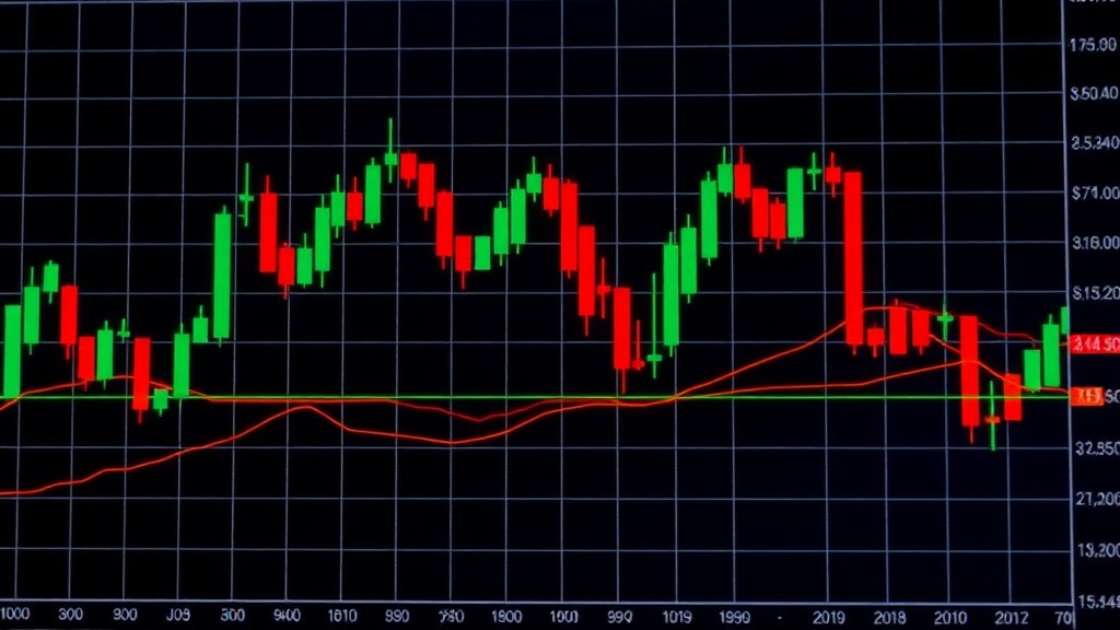
Integrating US stock market data into platforms designed for other asset classes, like cryptocurrencies, frequently exposes a persistent issue: candlestick charts that exhibit jarring jumps around market open and close. This discontinuity arises because raw data feeds often dump all trades into a single, undifferentiated stream. This approach fails to account for the distinct trading sessions of US equities: the pre-market (4:00 AM to 9:30 AM ET), the regular trading session (9:30 AM to 4:00 PM ET), and the after-hours session (4:00 PM to 8:00 PM ET). Consequently, pre-market price movements can vanish from the visual timeline, and low-volume after-hours trades can create misleading phantom volume spikes. For professional advisors and algorithmic traders, whose decisions rely on accurate visual representation of price action, these gaps and distortions are more than just an aesthetic problem; they are a functional impediment.
The demand for a visually continuous chart that maintains logical accuracy across these distinct periods is high. Without it, users must either accept a visually fragmented representation or resort to manual data manipulation, a time-consuming and error-prone process. This challenge is compounded by the fact that different user groups have varying needs. Algorithmic traders may require precise data for backtesting and live execution, while financial advisors might prioritize a cleaner visual narrative for client presentations. Bridging this gap requires a data processing approach that respects the structure of the US stock market's trading day.
Traditional Pains: When Advisors Manually Strip Session Noise
Before developing a robust solution, the engineering team conducted extensive interviews with power users. A recurring theme emerged: many advisors and sophisticated traders spent considerable time manually stripping session noise from their charts. This often involved custom scripts or painstaking manual adjustments to remove the visual clutter caused by after-hours trading or to ensure that the opening price of the regular session was properly linked to the closing price of the previous day's after-hours session. This manual intervention not only consumed valuable time but also introduced the risk of human error, potentially leading to flawed analysis or incorrect trading decisions. The inefficiency and unreliability of these manual workarounds underscored the need for an automated, systematic solution that could natively handle the complexities of US equity trading sessions.
The core of the problem lies in how trading data is aggregated and displayed. Standard charting libraries often assume a continuous flow of data, treating every tick equally. However, the US stock market's multi-session structure means that prices can gap significantly between the close of one session and the open of the next. Ignoring these gaps can lead to misinterpretations of market momentum and volatility. For instance, a sharp rise in pre-market trading might not be visible on a standard chart, or a sudden drop in after-hours could be smoothed over, presenting a false sense of stability. This is particularly problematic for strategies that are sensitive to price gaps or rely on the continuity of price action across the entire 24-hour cycle, albeit with distinct trading periods.
A Three-Layer Session Tagging Approach
To address these challenges, a novel three-layer session tagging approach was developed. This method segments the trading day into logical periods, allowing for distinct data processing and visualization. The three layers are:
- Pre-Market Session: This layer captures trading activity from 4:00 AM ET to 9:30 AM ET. Data from this period is crucial for understanding early price discovery and sentiment before the main market opens.
- Regular Trading Session: This is the standard 9:30 AM to 4:00 PM ET window, where the majority of trading volume and liquidity occurs.
- After-Hours Session: This layer covers trading from 4:00 PM to 8:00 PM ET, capturing post-market activity and reactions to news released after the close.
Each tick or bar within these sessions is tagged with its corresponding session identifier. This tagging allows charting libraries and analytical tools to treat data from each session appropriately. For example, when rendering a chart, the system can draw a line connecting the close of the after-hours session to the open of the pre-market session, or the close of the pre-market to the open of the regular session, explicitly showing the gap. Alternatively, for a visually continuous feel, the system can simply ensure that the data points are plotted sequentially without visual breaks, while the underlying session tags provide the context for any price jumps.
The benefit of this layered approach is twofold. First, it preserves the integrity of the data by acknowledging the distinct trading periods and their associated price movements. Second, it offers flexibility in visualization. Users can choose to see explicit gaps, or they can opt for a continuous chart where the session tags inform the interpretation of price action. This nuanced handling of data prevents the creation of misleading