The Conflict Between UI Trends and User Needs
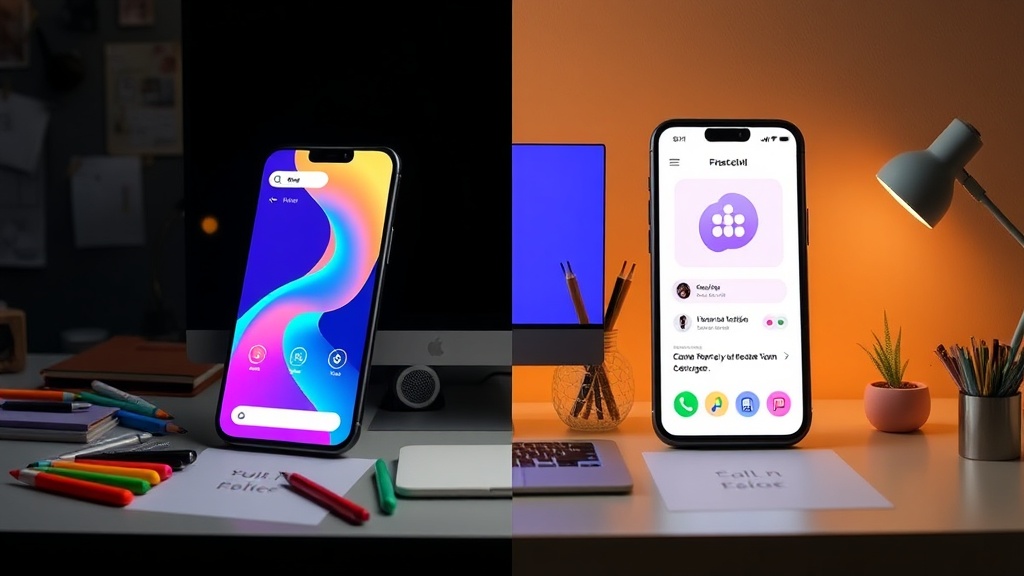
Many contemporary UI trends prioritize novelty and engagement, aiming to capture user attention and signal innovation. Features like rapid animations, complex gestures, and constantly shifting layouts are common in consumer apps designed for entertainment or productivity. However, these same elements can be detrimental when applied to mental health applications. For users experiencing distress, anxiety, or depression, these trends can increase cognitive strain, create confusion, and undermine the sense of safety and refuge the app aims to provide.
Kat Homan, in her work for Smashing Magazine, introduces a crucial evaluation framework for designers. This framework challenges the impulse to adopt every new UI fashion, instead urging a critical assessment of whether trendy visual and interaction patterns actually support or detract from the unique, sensitive goals of mental health experiences. The core conflict lies in the differing objectives: while a gaming app might aim to gamify engagement through challenging interfaces, a mental health app should aim for clarity, calm, and accessibility. This requires a deliberate design philosophy that places user wellbeing above aesthetic fads.
Cognitive Load and Emotional Impact
Distressed users often have limited cognitive resources. Their ability to process complex information, navigate intricate interfaces, or adapt to rapidly changing visual stimuli is significantly impaired. When a mental health app employs flashy transitions, unclear iconography, or an overwhelming amount of information, it inadvertently adds to this cognitive load. This can lead to frustration, abandonment of the app, and a feeling of failure, which is precisely the opposite of what a therapeutic tool should achieve.
Consider, for instance, the trend of minimalist design taken to an extreme. While often lauded for its elegance, an overly sparse interface can sometimes lack clear affordances, leaving users unsure of how to proceed. For someone already struggling with decision paralysis or low motivation, ambiguous design choices can become insurmountable barriers. Similarly, the use of subtle, low-contrast color palettes, while aesthetically pleasing to some, can be difficult for users with visual impairments or those experiencing fatigue-related vision issues. The goal must be to create an environment that feels supportive and predictable, not one that requires significant mental effort to simply use.
Fostering Trust and Safety
Trust is paramount in mental health applications. Users are sharing sensitive personal information and seeking support during vulnerable moments. An interface that feels unstable, unpredictable, or overly commercial can erode this trust rapidly. Apps that constantly bombard users with notifications, upsell prompts, or feature updates that alter the core experience can feel intrusive and unreliable. This is in stark contrast to apps designed for social media or e-commerce, where constant engagement and novelty are often key metrics.
The design choices directly influence the perceived trustworthiness of the application. A clean, consistent, and transparent interface signals reliability. Features should be intuitive and predictable. For example, a mood tracking feature should clearly indicate how data is stored, who can access it, and how it is used to provide insights. If the design itself feels chaotic or opaque, users may question the security and efficacy of the app's core functions. This is why established patterns and clear visual hierarchy are often more beneficial than chasing the latest design fleeting trends. A sense of refuge is built on predictability and a clear understanding of how the tool works.
An Evaluation Framework for Mindful Design
Homan’s proposed framework encourages designers to move beyond subjective aesthetic preferences and engage in a more rigorous, user-centered evaluation. This involves asking critical questions about each design element:
- Does this element reduce cognitive load or increase it? For example, complex multi-step onboarding processes or hidden navigation menus can be problematic.
- Does this element foster a sense of calm and safety, or does it induce stress or urgency? Bright, flashing elements or aggressive call-to-action buttons fall into the latter category.
- Does this element build trust and transparency, or does it create ambiguity and suspicion? Vague privacy policies or unclear data usage explanations are detrimental.
- Does this element enhance accessibility for all users, including those with impaired cognitive or visual abilities? Over-reliance on color alone for conveying information, or tiny, unlabelled icons, are common pitfalls.
By systematically applying these questions, designers can make informed decisions about which UI trends are appropriate and which must be rejected for the sake of user wellbeing. It’s not about avoiding innovation entirely, but about ensuring that innovation serves the primary purpose of the application: to support users through difficult times. This means sometimes deliberately choosing a less flashy, more stable design pattern over a trendy one that might look good on a portfolio but fails the user in practice.
The Long-Term Value of Stability
While UI trends change rapidly, the fundamental needs of individuals seeking mental health support remain constant: a desire for understanding, a need for reliable tools, and a craving for a safe space. Apps that prioritize these enduring needs, even if they appear less cutting-edge, build deeper, more sustainable relationships with their users. This user loyalty and trust are far more valuable than the fleeting attention gained by adopting every new design fad. The most successful mental health applications will be those that are built on a foundation of empathy, informed by user research, and designed with a commitment to reducing barriers rather than creating them.
What nobody has addressed yet is the long-term impact on the mental health app market itself. If a significant number of apps chase fleeting UI trends, will it create a fragmented and untrustworthy ecosystem that ultimately discourages users from seeking digital support?