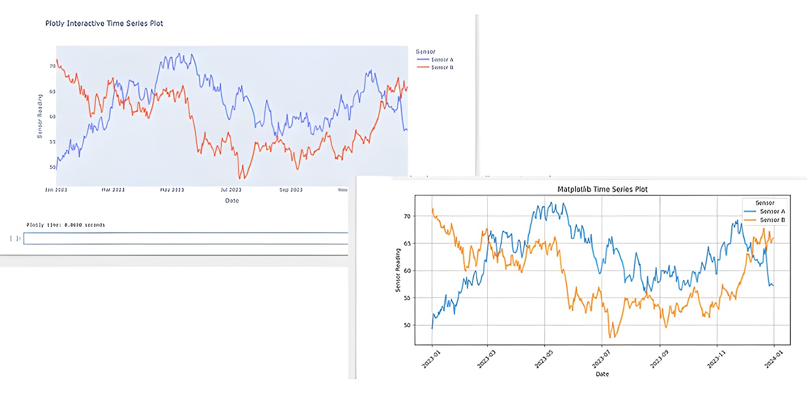
Introduction: The Landscape of Python Visualization
In the realm of data science and analysis with Python, the ability to effectively visualize data is paramount. Two libraries consistently rise to the top of discussions: Matplotlib and Plotly. While both serve the fundamental purpose of creating charts and graphs, they cater to different needs and offer distinct user experiences. Matplotlib, the veteran in the field, has long been the standard for producing static, publication-quality plots. Plotly, a more recent entrant, has carved out a niche with its emphasis on interactivity, web-based visualizations, and sophisticated dashboards. Understanding their core strengths, weaknesses, and optimal use cases is crucial for any Python developer or data professional seeking to communicate insights effectively.
This comparison delves into the fundamental differences between Matplotlib and Plotly, exploring their respective approaches to plotting, customization capabilities, interactivity features, and the ecosystems they inhabit. The choice between them is not about which library is definitively 'better,' but rather which tool aligns more closely with your specific project requirements, audience, and desired outcome. Whether you need a simple, static graph for a research paper or a dynamic, explorable dashboard for a web application, one of these libraries will likely be the superior choice.
Matplotlib: The Foundation of Static Visualization
Matplotlib is often described as the foundational plotting library for Python. Its design philosophy emphasizes control and flexibility, making it exceptionally powerful for creating highly customized static plots. Think of Matplotlib as a professional artist's toolkit: you have precise control over every brushstroke, color, and line. This granular control is invaluable when adhering to strict publication guidelines or when a specific, static visual representation is required. Its API, while sometimes verbose, allows for deep customization of virtually every element of a plot, from font types and sizes to line styles and marker appearances.
The library's strength lies in its ability to generate a wide array of chart types, from basic scatter plots and bar charts to complex 3D plots and specialized scientific visualizations. It integrates seamlessly with NumPy for numerical operations and is the backbone for many other plotting libraries in the Python ecosystem, which often build upon Matplotlib's core functionalities. For developers who prioritize static output, reproducibility, and deep customization for print or static reports, Matplotlib remains an indispensable tool. Its extensive documentation and large community support mean that solutions to most common plotting challenges can be found readily.
Plotly: Embracing Interactivity and Web-Native Graphics
Plotly takes a fundamentally different approach, focusing on creating interactive, web-native visualizations. Unlike Matplotlib's static output, Plotly charts are inherently dynamic, allowing users to zoom, pan, hover for data details, and even switch between different data views. This interactivity is achieved through its reliance on JavaScript (specifically, the Plotly.js library) for rendering, making the plots viewable in web browsers and easily embeddable in web applications, Jupyter notebooks, and dashboards. Plotly's charting capabilities extend beyond static plots to include sophisticated dashboards and data storytelling tools, such as Dash, which is built on top of Plotly.js, React, and Flask.
Plotly offers a high-level API that simplifies the creation of complex interactive plots with minimal code. While it also allows for customization, the focus is on enabling interactive features rather than minute control over every static element. This makes it an excellent choice for exploratory data analysis where users need to probe the data, or for applications where end-users will interact with the visualizations directly. The library supports a vast range of chart types, including advanced scientific charts, 3D plots, and statistical graphs, all with built-in interactivity.
Key Differences and Use Cases
The primary distinction lies in their output: Matplotlib produces static images (like PNG, JPG, PDF), while Plotly generates interactive HTML-based visualizations. This fundamental difference dictates their most suitable applications.
Static vs. Interactive Output
For academic papers, reports, or presentations where a fixed image is required, Matplotlib is often the preferred choice due to its fine-grained control over static output and its ability to generate high-resolution, publication-ready figures. Plotly can export static images, but its core strength is lost in this mode.
Ease of Use and Learning Curve
Plotly's high-level API often makes it easier to create visually appealing and interactive plots quickly, especially for common chart types. Matplotlib, while more powerful in customization, can have a steeper learning curve due to its more complex and sometimes less intuitive API. However, for developers already familiar with its paradigms, Matplotlib can be highly efficient.
Customization and Control
Matplotlib offers unparalleled control over every aspect of a plot. If you need to tweak a specific tick label's font or precisely control the spacing between subplots, Matplotlib provides the tools. Plotly offers customization, but it's generally geared towards interactive elements and overall plot themes rather than the pixel-level control offered by Matplotlib.
Interactivity and Web Integration
This is Plotly's domain. Its plots are designed for web environments and offer built-in interactivity like zooming, panning, and tooltips out-of-the-box. For dashboards and web applications, Plotly (and its companion framework Dash) is the clear winner. Matplotlib has limited built-in interactivity, primarily through its backends for GUI applications.
Ecosystem and Community
Matplotlib has a vast, mature ecosystem and a massive community. Many other Python libraries leverage Matplotlib for their plotting backend. Plotly also has a strong and growing community, particularly in the web development and data science spheres, and its integration with frameworks like Dash is a significant advantage for building full-fledged applications.
When to Choose Matplotlib
You should opt for Matplotlib when:
- Your primary requirement is static, publication-quality plots for reports, papers, or presentations.
- You need absolute control over every visual element of the plot.
- You are building visualizations that will be embedded in applications that do not support rich JavaScript interactivity.
- You are already deeply familiar with the Matplotlib API or working within a project that standardizes on it.
- You are creating complex scientific or statistical plots that require highly specialized rendering.
When to Choose Plotly
You should opt for Plotly when:
- Interactivity is a key requirement for your visualizations (e.g., for exploratory data analysis, dashboards, or end-user applications).
- You need to create web-based dashboards or integrate visualizations seamlessly into web applications (often using Dash).
- You want to quickly generate visually appealing, modern-looking charts with minimal code.
- You are presenting data to an audience that would benefit from interactive exploration.
- You are working with large datasets where interactive features like zooming and panning are essential for understanding trends.
Conclusion: A Tool for Every Job
Matplotlib and Plotly are both powerful tools, but they serve different needs within the Python data visualization landscape. Matplotlib excels at creating precise, static, publication-ready graphics, offering deep customization for those who need it. It is the reliable workhorse for traditional reporting and academic use. Plotly, on the other hand, shines in the realm of interactive, web-native visualizations, making it ideal for modern data exploration, dashboards, and interactive applications. The choice between them hinges on the specific demands of your project: the need for static versus dynamic output, the level of customization required, and the intended environment for your visualizations. Many data professionals find value in mastering both, leveraging Matplotlib for its static power and Plotly for its interactive capabilities, effectively equipping themselves with a comprehensive visualization toolkit.