Jumia Product Analysis With Excel Dashboards
Large e-commerce organizations like Jumia manage vast datasets crucial for daily operations. Evaluating this data is paramount for making sound business decisions that enhance overall performance. This article guides you through building comprehensive product analysis dashboards in Excel to facilitate smarter business choices.
Objective
The primary goal of this project is to create Excel dashboards that offer deep insights into product performance. Specifically, we aim to analyze product pricing, discounts, customer reviews, and ratings to understand product performance and identify key trends that can inform strategic adjustments.
Dataset Overview
The dataset for this analysis typically includes several key fields:
- Product: The name or identifier of the product.
- Current price: The current selling price of the product in Kenyan Shillings (Ksh).
- Old price: The original price of the product before any discounts were applied.
- Discount: The percentage or amount of discount offered on the product.
- Rating: The average customer rating for the product, often on a scale of 1 to 5.
- Number of reviews: The total count of customer reviews received for the product.
- Category: The product's classification or category (e.g., Electronics, Fashion, Home & Kitchen).
- Date Added: The date when the product was listed on the platform.
This structured data forms the foundation for building meaningful analytical dashboards. Each field provides a unique lens through which to view product performance.
Data Cleaning and Preparation
Before any analysis can commence, the raw data must be cleaned and prepared. This is a critical step, as errors or inconsistencies in the data can lead to flawed insights. Common cleaning steps include:
- Handling Missing Values: Identify and address any missing data points. Depending on the field and the extent of missing data, this might involve imputation (e.g., using the average rating for missing ratings) or removing rows with critical missing information.
- Standardizing Formats: Ensure that all data is in a consistent format. For example, prices should be numerical, dates should follow a uniform date format, and text fields like product names or categories should be standardized (e.g., converting all category names to lowercase or title case).
- Data Type Conversion: Convert columns to their appropriate data types. For instance, price columns should be numerical, and date columns should be recognized as dates by Excel to allow for time-based analysis.
- Removing Duplicates: Identify and remove any duplicate product entries that might skew the analysis.
- Calculating Derived Fields: Create new fields that are not directly present in the raw data but are essential for analysis. For example, calculating the discount percentage from the 'Current price' and 'Old price' fields. The formula for discount percentage could be
((Old price - Current price) / Old price) * 100.
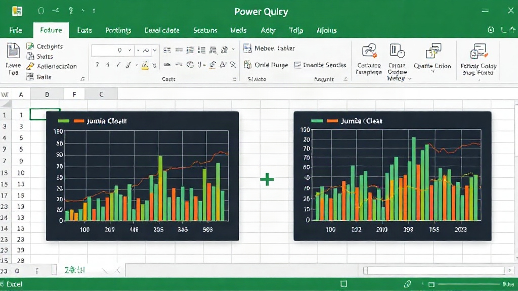
Excel's Power Query (Get & Transform Data) is an invaluable tool for this stage. It allows for repeatable data cleaning processes, meaning that if new data is added, the cleaning steps can be refreshed automatically.
Building the Dashboard: Key Components
A well-designed dashboard should present information clearly and concisely, enabling users to quickly grasp key performance indicators (KPIs). For Jumia's product analysis, several components are essential:
Product Performance Summary
This section provides an overview of key metrics:
- Total Products: A count of all active products.
- Average Rating: The overall average customer rating across all products.
- Average Discount Percentage: The average discount offered across all products.
- Total Reviews: The sum of all customer reviews.
These metrics can be displayed using simple number cards or summary tables.
Sales and Discount Analysis
Understanding how pricing and discounts affect sales is crucial. This can be visualized through:
- Price Distribution Histogram: A histogram showing the frequency of products within different price ranges. This helps identify popular price points and potential gaps in the product catalog.
- Discount vs. Rating Scatter Plot: A scatter plot to visualize the relationship between the discount percentage and the customer rating. This can reveal whether higher discounts correlate with better or worse customer satisfaction.
- Average Discount by Category Chart: A bar chart comparing the average discount percentage across different product categories. This highlights which categories are most frequently discounted.
The 'Current Price' and 'Discount Percentage' derived fields are central to this analysis.
Customer Review and Rating Analysis
Customer feedback is invaluable. This section focuses on:
- Top-Rated Products: A table or list showing products with the highest average ratings, potentially filtered by category or number of reviews to focus on statistically significant data.
- Products with Most Reviews: A similar list identifying products that generate the most customer feedback, indicating high engagement or potential issues that prompt reviews.
- Rating Distribution Chart: A chart showing the distribution of ratings (e.g., count of 1-star, 2-star, ..., 5-star ratings). This provides a granular view of customer sentiment.
Analyzing the 'Rating' and 'Number of reviews' fields is key here.
Category Performance
Understanding performance by category helps in strategic resource allocation:
- Products per Category Chart: A bar or pie chart showing the number of products in each category.
- Average Rating by Category: A bar chart comparing the average rating across different product categories.
- Average Price by Category: A bar chart showing the average selling price for products in each category.
These charts, utilizing 'Category', 'Rating', and 'Current Price', provide a high-level view of category strengths and weaknesses.
Implementing Dashboards in Excel
Excel offers powerful tools for creating interactive dashboards:
- PivotTables and PivotCharts: These are the backbone of dynamic dashboards. PivotTables allow for summarizing large datasets, and PivotCharts provide visual representations of this summarized data. They can be easily filtered and updated.
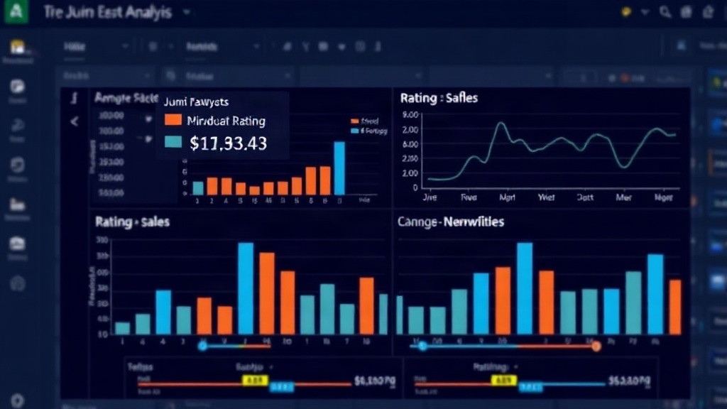
- Slicers and Timelines: For interactive filtering, slicers and timelines can be added to PivotCharts and PivotTables. This allows users to dynamically filter the data displayed on the dashboard by category, date range, or discount level without manually adjusting filters.
- Conditional Formatting: Use conditional formatting to highlight key data points, such as products with ratings below a certain threshold or discounts above a target percentage. This draws attention to critical information at a glance.
- Formulas: Employ Excel formulas for calculations like discount percentage, profit margins (if cost data is available), and other KPIs not directly available in the raw data.
The process involves setting up your cleaned data in an Excel Table, creating PivotTables to aggregate and analyze the data, and then building PivotCharts and other visual elements on a separate dashboard sheet. Slicers connected to these PivotTables make the dashboard interactive.
Interpreting the Insights
Once the dashboard is built, the real value lies in interpreting the insights it provides. For instance:
- If a product category consistently shows low average ratings despite high discounts, it might indicate quality issues or misleading marketing.
- Products with a high number of reviews but declining ratings could signal emerging problems that need immediate attention.
- Identifying price points where product density is highest can inform pricing strategies and inventory management.
This analysis is not a one-time activity. Regularly updating the dashboard with fresh data allows for continuous monitoring of product performance and adaptation to market changes.
Broader Implications for E-commerce
The methodology described here is applicable beyond Jumia. Any e-commerce platform dealing with product listings, pricing, discounts, and customer feedback can leverage similar Excel-based dashboards for:
- Inventory Management: Identifying slow-moving products or categories that might require promotional activity or discontinuation.
- Marketing Strategy: Understanding which product attributes (price, rating, category) resonate most with customers to tailor marketing campaigns.
- Customer Service Improvements: Pinpointing products with a high volume of negative reviews to address common customer pain points.
- Competitive Analysis: While not directly covered, the framework can be extended to include competitor pricing if such data is available.
By transforming raw data into actionable insights through well-structured Excel dashboards, businesses can navigate the complexities of the e-commerce landscape with greater clarity and confidence, driving growth and customer satisfaction.