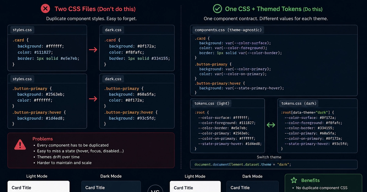
The Allure of a Separate Dark Mode File
The initial thought when implementing dark mode is often straightforward: create a separate CSS file, say dark.css, to house all the overrides for your light theme's styles.css. For small projects or simple interfaces, this approach might seem perfectly reasonable. It offers a clear separation of concerns, making it appear easy to manage the two distinct visual states of the application. You have your primary styles, and then a distinct set for the dark theme. This segregation suggests a clean, modular design.
However, this simplicity is deceptive. As applications grow in complexity and scale, the two files begin to diverge. What starts as a set of overrides morphs into two parallel implementations of the same user interface. Every change made to a component in the main stylesheet requires a corresponding, manual update in the dark mode file. This duplication of effort quickly becomes a significant maintenance burden.
The Escalating Cost of Duplication
Consider the typical development workflow. A developer updates a component's styling in styles.css. They might add a new hover state, adjust padding, or change a font size. If they forget to replicate this change in dark.css, the dark mode version of that component will immediately look out of sync. The user experience breaks. The same applies when a new feature is introduced or an existing one is refined. Each enhancement to the default interface necessitates a hunt for the corresponding CSS rule in the dark theme file, followed by a careful replication of the change.
This dual maintenance burden means that dark mode implementation isn't just about creating a different aesthetic; it becomes a second, parallel development track for your entire UI. The cost isn't just in writing the CSS twice; it's in the increased cognitive load, the higher chance of introducing bugs, and the slower iteration cycles. The team spends more time ensuring consistency than on building new features or improving the core functionality of the application.
Why This Approach Fails at Scale
The fundamental problem lies in treating dark mode as a separate entity rather than an intrinsic variation of the UI. When you have two distinct CSS files, the relationship between them is inherently brittle. The dark.css file often becomes a long list of selectors, each with a specific override. This makes it difficult to understand the actual styles applied to an element in dark mode without cross-referencing both files. It’s like trying to understand a conversation where half the sentences are in one room and the other half are in another.
Furthermore, specific styling concerns, like accessibility features such as focus rings or disabled states, must be managed in both files. A change to how a disabled button looks in the light theme needs to be mirrored precisely in the dark theme. This isn't just tedious; it’s error-prone. A slight difference in opacity, color, or border-radius can render the dark mode experience jarring or, worse, unusable.
The complexity grows exponentially with the size of the application. Imagine an e-commerce site with hundreds of components, each with intricate styling. Maintaining a separate dark mode file for all of them transforms a simple theme switch into a full-blown parallel styling project. Developers might start to implement dark mode styles directly into component files, further blurring the lines and creating a tangled mess of conditional styling that is even harder to manage.
A Better Way: CSS Variables and Theming
The more robust and scalable solution involves using CSS Custom Properties (variables) and a single, unified stylesheet. Instead of separate files, you define your color palettes, spacing units, and other design tokens as CSS variables. These variables can then be dynamically updated using JavaScript or, more elegantly, through a single class applied to the body or html element.
Here's how it typically works:
- Define Design Tokens: In your main CSS file, define variables for colors, backgrounds, and other themeable properties.
:root {
  --background-primary: #ffffff;
  --text-primary: #333333;
  --button-background: #007bff;
  --button-text: #ffffff;
}
- Apply Variables: Use these variables throughout your stylesheet for all elements.
body {
  background-color: var(--background-primary);
  color: var(--text-primary);
}

.button {
  background-color: var(--button-background);
  color: var(--button-text);
}
- Implement Dark Mode Switch: Create a class, for example,
.dark-mode, that overrides these variables. This class is toggled via JavaScript when the user opts for dark mode.
.dark-mode {
  --background-primary: #1a1a1a;
  --text-primary: #eeeeee;
  --button-background: #55aaff;
  --button-text: #111111;
}
When the .dark-mode class is applied to the body, all elements using the defined variables will instantly adopt the dark theme colors without needing a separate CSS file. This approach keeps all styling logic within a single, coherent stylesheet.
This method ensures that styles are defined once and applied everywhere. The maintenance burden is drastically reduced because any change to a component's styling is made in one place. The dark mode isn't an afterthought or a separate implementation; it's simply a different set of values for the same design tokens. This makes the codebase cleaner, more maintainable, and significantly less prone to inconsistencies.
The Benefit of Unified Styling
Using CSS variables for theming, including dark mode, offers a unified approach to styling. It treats the theme as a layer of configuration rather than a separate codebase. This is more akin to how design systems operate, where core components are styled once and then customized through themes or tokens. For developers, this means a single source of truth for styles. For designers, it means greater confidence that the dark mode implementation accurately reflects the intended aesthetic without unexpected deviations.
The surprising detail here is not the technical feasibility of CSS variables, which have been widely supported for years, but the persistent tendency for teams to opt for the seemingly simpler, yet ultimately more costly, approach of separate CSS files. This often stems from a misunderstanding of how much complexity a dual-file system introduces as an application scales. Embracing CSS variables for theming is not just a best practice; it's a necessity for maintaining modern, scalable web applications efficiently.