The Evolution of Motion in CSS: From motion-path to offset-path
CSS has long sought to provide developers with powerful tools for creating dynamic and engaging web experiences. Among these tools, animating elements along custom paths has been a persistent goal. Initially, this functionality was introduced under the umbrella of the `motion-*` properties, with `motion-path` being the key player for defining movement trajectories. However, the CSS Working Group recognized the need for a more standardized and cohesive naming convention. This led to the evolution of `motion-path` into `offset-path` and its related properties like `offset-distance` and `offset-anchor`. This transition, while aiming for clarity and consistency, means developers working with current implementations might need to support both syntaxes for broader browser compatibility.
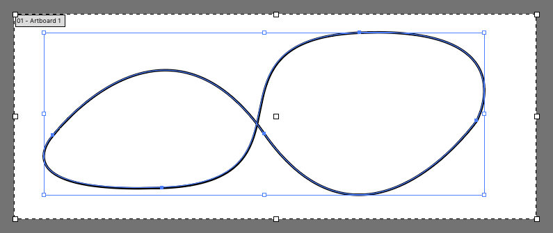
The core concept behind `offset-path` is to decouple the definition of an element's movement trajectory from the animation itself. Instead of relying solely on keyframe animations to dictate a linear or stepped movement, `offset-path` allows designers to specify a precise path—often derived from Scalable Vector Graphics (SVG)—that an element will follow. This opens up a world of possibilities for creating intricate animations that go far beyond simple translations or rotations. Think of it less like a car driving on a straight road and more like a race car navigating a complex, winding track.

Defining the Path: SVG Syntax in CSS
The `offset-path` property accepts a value that specifies the path. The most common and powerful method is using the `path()` function, which takes an SVG path string as its argument. SVG path data is a mini-language for describing shapes and trajectories. For instance, a simple circular path can be defined as `path('M 5 5 m -4, 0 a 4,4 0 1,0 8,0 a 4,4 0 1,0 -8,0')`. This string defines a circle with a radius of 4 centered at coordinates (5,5).
The syntax within the `path()` function is identical to that used in SVG itself. This includes commands like:
M(moveto): Starts a new subpath at the given coordinates.L(lineto): Draws a straight line from the current point to the specified coordinates.C(curveto): Draws a cubic Bézier curve.A(elliptical arc): Draws an elliptical arc.Z(closepath): Closes the current subpath by drawing a straight line from the current point to the starting point of the subpath.
By combining these commands, developers can construct virtually any shape or trajectory imaginable. This flexibility is what makes `offset-path` so powerful. You can create paths that are linear, curved, complex, or even imported from design tools that export SVG path data.
Animating Along the Path: offset-distance and Keyframes
While `offset-path` defines where an element moves, it doesn't inherently dictate how or when it moves along that path. This is where `offset-distance` and CSS animations (or transitions) come into play. `offset-distance` is a property that specifies the element's position along the defined path. It can be set to a length (e.g., `50px`) or a percentage. When used with a percentage, `100%` typically means the element has reached the end of the path.
To create an animation, you would typically combine `offset-path` with CSS `@keyframes`. For example, you can animate the `offset-distance` property from `0%` to `100%` over a set duration. This tells the browser to move the element from the start of the path to the end of the path over the course of the animation.
.thing-that-moves {
  offset-path: path('M 5 5 m -4, 0 a 4,4 0 1,0 8,0 a 4,4 0 1,0 -8,0');
  animation: move 3s linear infinite;
}

@keyframes move {
  100% {
    offset-distance: 100%;
  }
}
This example defines a circular path using `offset-path` and then animates the `offset-distance` to `100%` over 3 seconds, repeating infinitely. The `linear` timing function ensures a constant speed along the path. This approach allows for smooth, continuous motion that precisely follows the defined SVG trajectory.

Beyond Basic Motion: offset-anchor and Orientation
The `offset-path` property is not just about the path itself; it also works in concert with other related properties to control the element's behavior. One such property is `offset-anchor`. By default, the element's `transform-origin` is used as the anchor point on the element that aligns with the path. `offset-anchor` allows you to specify a different point on the element to align with the path, offering finer control over how the element is positioned and oriented.
Furthermore, the `offset-rotate` property controls how the element is oriented as it moves along the path. It can be set to `auto`, which means the element will rotate to face the direction of the path at its current position. Alternatively, it can be set to `auto-reverse`, which rotates the element in the opposite direction of the path. You can also specify a fixed angle, or use keywords like `reverse` to flip the orientation.
These properties, when combined, provide a sophisticated system for animating elements. You can make an object not only follow a complex route but also dynamically adjust its orientation to appear as if it's naturally traversing the space. For instance, a car icon could be animated along a road path, always appearing to drive forward along the road's curvature.
Browser Support and Future Considerations
As mentioned, `offset-path` is the current specification, but older implementations and some browsers might still rely on the `motion-path` syntax. Developers should consult the latest browser compatibility tables to ensure their implementations work across target audiences. caniuse.com is an excellent resource for this. Support for `offset-path` is generally good in modern Blink-based browsers (Chrome, Edge) and is also available in Firefox.
The transition from `motion-path` to `offset-path` signifies a maturing of CSS animation capabilities. While the learning curve for SVG path syntax might seem steep initially, the power and flexibility it offers for creating custom animations are substantial. For web developers aiming to create visually rich and interactive interfaces, understanding and utilizing `offset-path` is becoming increasingly important.
The ability to define complex motion directly within CSS, leveraging the descriptive power of SVG, empowers designers and developers to craft animations that were previously only achievable with JavaScript or complex pre-rendering. This makes the web a more dynamic and engaging canvas.