The Limits of `border-radius`
For decades, web developers have relied on the humble `border-radius` property to soften the sharp edges of user interfaces. It’s a fundamental tool for creating rounded buttons, cards, and input fields. However, `border-radius` has always been a one-trick pony: it only produces perfect quarter-circles. Achieving any other shape for corners—beveled, scooped, or the increasingly popular squircle—has required convoluted workarounds. Developers have resorted to techniques like using multiple background layers, complex SVG masks, or the `clip-path` property. These methods are often brittle, difficult to maintain, and can introduce performance overhead. They represent a significant amount of developer time spent fighting the browser’s limitations rather than building features.
The need for more sophisticated corner treatments stems from evolving design trends and the desire for unique, branded aesthetics. While perfect circles are ubiquitous, designers have pushed for more organic and visually distinct shapes. The squircle, in particular, has gained traction due to its pleasing balance between a circle and a square, offering a softer, more contained feel than a sharp corner but without the complete roundness of a circle. Until now, implementing such shapes reliably across different browsers and devices has been a significant engineering challenge.
Introducing `corner-shape`
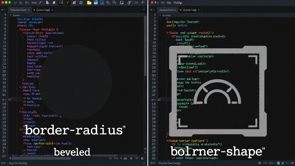
The new CSS `corner-shape` property directly addresses this long-standing problem. It provides native support for defining various corner styles beyond simple curves. This property works in conjunction with `border-radius` to define the precise shape of the corner. Instead of hacking with `clip-path` or SVGs, developers can now declare their desired corner geometry directly in CSS. This simplifies development, improves performance, and makes complex UI elements more accessible to a wider range of developers.
The initial values for `corner-shape` include:
auto: The default behavior, which implies using `border-radius` to create quarter-circle corners.bevel: Creates a straight, angled cut across the corner, forming a beveled edge.scoop: Creates a concave, scooped-out effect at the corner.squircle: Generates the characteristic smooth, rounded yet slightly squared shape of a squircle.
These values allow for a much richer design vocabulary directly within CSS. For instance, applying `corner-shape: squircle` to a container element will automatically render its corners as squircles, respecting the `border-radius` value for the degree of curvature. This is a fundamental shift from the previous requirement of manually drawing these shapes or clipping elements.
Under the Hood: How it Works
The `corner-shape` property leverages modern CSS layout and rendering engines to achieve these effects efficiently. Unlike `clip-path`, which can be computationally expensive and tricky to animate, `corner-shape` is designed to be a first-class citizen in the rendering pipeline. This means it should perform better, especially when applied to many elements on a page or when animated. The browser’s rendering engine can optimize the drawing of these shapes, similar to how it handles standard `border-radius`.
The interplay between `border-radius` and `corner-shape` is key. `border-radius` still defines the overall extent of the corner rounding. `corner-shape` then dictates the *style* of that rounded area. For example, if you set `border-radius: 20px` and `corner-shape: squircle`, you get a squircle shape that extends 20px from the corner. If you set `border-radius: 20px` and `corner-shape: bevel`, you get a beveled edge that effectively cuts off the corner area, with the `border-radius` value influencing the depth or angle of the bevel in some implementations (though the exact interpretation can vary slightly between browser vendors and may be subject to further standardization).
This declarative approach means developers no longer need to think about the underlying geometry or pixel-perfect calculations. They can simply state their intent: “I want a squircle corner of this size.” The browser handles the rest. This significantly lowers the barrier to entry for creating sophisticated UI elements and opens up new avenues for creative design without sacrificing performance or maintainability.
Implications for UI Design and Development
The introduction of `corner-shape` promises to streamline front-end development workflows. Designers can now confidently specify these advanced corner styles in their mockups, knowing that native CSS support exists. This reduces the need for design-to-development translation friction and the inevitable compromises that arise when translating complex graphical elements into web standards.
For developers, this means less time spent on workarounds and more time on building core application logic. Debugging UI bugs related to complex shapes becomes simpler. Furthermore, the potential for better performance and accessibility is significant. Elements with custom corner shapes can now be more easily integrated into responsive layouts and animated transitions, as the browser can treat them as standard layout primitives rather than arbitrary clipped elements.
The broader impact on the web design landscape could be substantial. We may see a proliferation of UIs that move beyond the standard rounded rectangles. Expect to see more applications adopting distinctive corner styles to build stronger brand identities and create more engaging user experiences. This property is less about a minor aesthetic tweak and more about empowering designers with fundamental building blocks that were previously out of reach for standard CSS.
What’s Next?
While `corner-shape` is now available in modern browsers, its adoption will likely follow the typical path of new CSS features. Developers will begin experimenting, sharing best practices, and discovering new creative applications. Browser vendors will continue to refine implementations, potentially adding more shape options or refining the existing ones based on developer feedback and usage patterns. The surprising detail here is not the existence of the property itself, but how long it took for such a fundamental design element to be standardized, highlighting the complex evolution of web standards.
If you’re building user interfaces today, it’s time to explore how `corner-shape` can elevate your designs. Moving beyond the ubiquitous `border-radius` is no longer a complex hacking exercise but a straightforward CSS declaration. This is a clear signal that the web platform is maturing, providing more expressive power directly to designers and developers.