A Unified Design System for Modern Web Development
The demand for consistent user experiences across diverse technology stacks has never been higher. Developers often face the challenge of maintaining a unified look and feel when working with multiple JavaScript frameworks, particularly in large enterprise applications. This is precisely the problem AWC UI aims to solve.
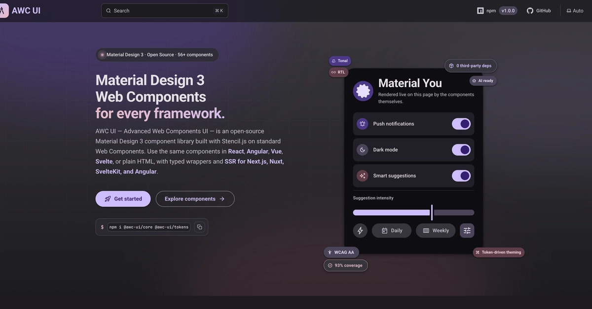
AWC UI is a new open-source library that delivers Material Design 3 components built on standard Web Components. This framework-agnostic approach means developers can leverage a single, consistent set of UI elements regardless of whether their project uses React, Angular, Vue, or Svelte. The library offers 56 Material Design 3 components, designed with enterprise-level practical features in mind.
The core motivation behind AWC UI, according to its creator, was the lack of a comprehensive Material Design 3 library that was both framework-agnostic and catered to the specific needs of larger applications. Key features include accessible forms, robust theming capabilities, right-to-left (RTL) support, and server-side rendering (SSR) compatibility. These elements are crucial for building scalable, internationalized, and performant web applications.
The library's foundation in Web Components is its defining characteristic. This standard allows components to be encapsulated and reusable across different frameworks, effectively eliminating the need to maintain separate UI component sets for each technology. This approach streamlines development, reduces code duplication, and ensures a more cohesive user interface throughout an application or across multiple projects within an organization.
Core Components and Features
AWC UI provides a substantial collection of 56 components, covering a wide array of UI needs. These range from fundamental building blocks like buttons, text fields, and typography to more complex elements such as data tables, dialogs, and navigation drawers. Each component adheres to the latest Material Design 3 guidelines, ensuring a modern and intuitive user experience.
Accessibility is a primary focus. AWC UI components are built with ARIA standards and keyboard navigation in mind, making them suitable for users with disabilities. This is particularly important for enterprise applications where compliance and inclusivity are often mandated.
Theming is another critical aspect. AWC UI supports extensive customization through CSS variables, allowing developers to easily adapt the look and feel of components to match their brand identity. This includes adjusting colors, typography, and shapes, all while maintaining the underlying Material Design 3 structure. The library's approach to theming is designed to be flexible, accommodating both simple color changes and more complex design system integrations.
RTL support is included out-of-the-box, which is essential for applications targeting global audiences. This ensures that layouts and text flow correctly in languages that read from right to left, such as Arabic and Hebrew. Server-side rendering (SSR) support further enhances performance and SEO by allowing components to be rendered on the server before being sent to the client, leading to faster initial page loads and improved search engine visibility.
Web Components: The Framework-Agnostic Backbone
The decision to build AWC UI on Web Components is a strategic one. Web Components are a set of web platform APIs that allow you to create new custom, reusable, encapsulated HTML tags for your websites and applications. They are a W3C standard, meaning they are supported natively by all modern browsers.
This native support bypasses the need for framework-specific wrappers or bindings. A React component can seamlessly integrate with an Angular component, and both can use AWC UI components without issue. This interoperability is a significant advantage for organizations with mixed-framework codebases or those planning to migrate between frameworks over time. It's like having a universal adapter for your UI elements that works everywhere.
The encapsulation provided by Web Components means that component styles and logic are contained within the component itself. This prevents style conflicts and ensures that components behave predictably, regardless of the surrounding application code. This isolation is a boon for maintainability and reduces the potential for unexpected side effects when updating or swapping out components.
The AWC UI Ecosystem and Future
AWC UI is released under the permissive MIT license, making it free for both commercial and non-commercial use. The project also features an application showcase, demonstrating how the components can be used to build functional applications, providing practical examples for developers looking to integrate AWC UI into their projects.
The library currently offers 56 components, and the roadmap likely includes expansion based on community feedback and evolving design standards. The framework-agnostic nature of AWC UI positions it as a valuable tool for development teams seeking to standardize their UI across various projects and technologies. By abstracting the UI layer to a common standard, AWC UI empowers developers to focus more on application logic and less on the intricacies of cross-framework component management.
The success of AWC UI will depend on its adoption by the developer community and its ability to keep pace with updates to Material Design and Web Component standards. However, its foundational approach addresses a persistent pain point in modern web development, offering a compelling solution for building consistent, accessible, and maintainable user interfaces.