
The Accessibility Blind Spot in Component Development
For years, accessibility in web development has been an afterthought, a task deferred until 'later.' This isn't typically due to malice or neglect, but a consequence of the immense pressure developers face. Juggling state management, intricate layouts, and tight deadlines often pushes accessibility concerns to the back burner. The reality is, you can't fix a lack of accessibility through sheer willpower alone; it requires a structured approach. A checklist is the most effective tool to embed accessibility into the development workflow, ensuring it's addressed proactively, not reactively.
This checklist is designed for Angular developers aiming to meet WCAG 2.1 Level AA standards. It's tailored to the Angular ecosystem and, crucially, ordered to reflect how issues commonly surface during development. This pragmatic ordering helps developers catch and fix problems efficiently, integrating accessibility into the natural flow of building components.
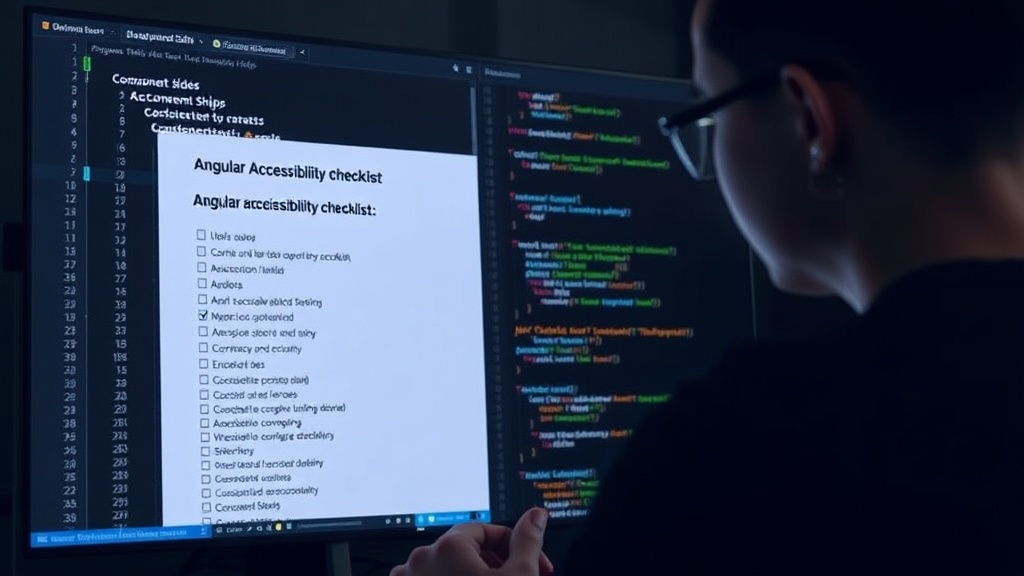
Automated Tools: A Starting Point, Not a Solution
Automated accessibility testing tools like AXE, Lighthouse, and others are invaluable. They excel at identifying objective, mechanical issues such as missing alt text on images, insufficient color contrast ratios, or duplicate IDs. These tools can typically catch between 30% to 40% of all WCAG issues. However, they are fundamentally limited. They cannot understand context, user intent, or the complex interactions that define a truly accessible user experience. Relying solely on automated tools means leaving a significant portion of accessibility problems unaddressed, often the most complex and impactful ones.
The Angular WCAG AA Checklist
1. Semantic HTML and ARIA Attributes
The foundation of accessible interfaces lies in using semantic HTML elements correctly. This means leveraging tags like <nav>, <main>, <button>, and <input> for their intended purposes. When custom components are built, or standard elements are used in non-standard ways, ARIA (Accessible Rich Internet Applications) attributes become critical. These attributes provide essential information to assistive technologies like screen readers.
- Role, State, and Property: Ensure custom components have appropriate ARIA roles (e.g.,
role="dialog",role="tablist"). Manage states and properties dynamically (e.g.,aria-expanded,aria-selected,aria-disabled). - Focus Management: Interactive elements must be focusable. Users should be able to navigate through all interactive elements using the keyboard alone. For dynamic content like modals or dropdowns, ensure focus is managed correctly – trapping focus within a modal and returning it to the trigger element when dismissed.
- Labels and Descriptions: All form controls and interactive elements must have clear, descriptive labels. This can be achieved using
<label for="id">,aria-label, oraria-labelledby. Complex elements might requirearia-describedbyfor additional instructions.
2. Keyboard Navigation and Interaction
Keyboard accessibility is paramount. Users who cannot use a mouse must be able to operate all functionality using only a keyboard. This involves ensuring a logical tab order and visible focus indicators.
- Tab Order: The order in which elements receive focus when the Tab key is pressed must be logical and intuitive, generally following the visual flow of the page. Avoid using
tabindexvalues other than 0 or -1 unless absolutely necessary and with extreme caution. - Visible Focus Indicator: Elements that receive keyboard focus must have a clear visual indicator. Browsers provide default outlines, but custom styling must ensure this indicator is easily discernible against all backgrounds and states. Avoid removing outlines with
outline: none;without providing a robust custom replacement. - Keyboard Operability: All interactive elements (buttons, links, form fields, custom controls) must be operable via the keyboard. This means pressing Enter or Spacebar should trigger the expected action, just as a click would. Ensure custom components that mimic native controls (like custom checkboxes or accordions) handle keyboard events correctly.
3. Color and Contrast
Visual presentation is critical for users with low vision or color blindness. Color alone should never be the sole means of conveying information, and text must have sufficient contrast against its background.
- Contrast Ratio: Text and interactive UI elements must meet a contrast ratio of at least 4.5:1 against their background (WCAG AA). For large text (18pt or 14pt bold), the ratio can be 3:1. Use color contrast checking tools to verify compliance.
- Information Conveyed by Color: Ensure that information conveyed by color is also available through other means. For example, error messages should not just be red text; they should also include an icon and clear accompanying text. Required form fields should have a visible indicator beyond just color.
4. Forms and Input
Forms are a common point of failure for accessibility. Clear instructions, error handling, and proper labeling are essential.
- Clear Labels: Every form input (text fields, checkboxes, radio buttons, selects) must have an associated, visible label. Use
<label for="input-id">. - Error Identification and Suggestion: When form submission results in an error, clearly identify the error, describe it to the user in text, and indicate which field(s) are in error. Provide suggestions for correction where possible. Use
aria-invalid="true"andaria-describedbyto link error messages to inputs. - Input Constraints: If there are specific input format requirements (e.g., date format, phone number format), provide clear instructions and examples. Use HTML5 input types (
email,tel,number) where appropriate.
5. Dynamic Content and Updates
Modern Angular applications frequently use dynamic content, AJAX updates, and complex component interactions. These aspects require careful consideration for accessibility.
- Live Regions: For content that updates dynamically without a page reload (e.g., status messages, notifications, search results), use ARIA live regions (
aria-live="polite"oraria-live="assertive") to announce these changes to screen reader users. Choose the appropriate politeness level based on the urgency of the information. - Modals and Overlays: When modals or dialogs appear, they should receive focus, and focus should be trapped within the modal until it is closed. When the modal is closed, focus should return to the element that triggered it. Ensure modals are dismissible via the Escape key.
- Component State Changes: Ensure that changes in component state (e.g., an accordion expanding, a tab becoming active) are conveyed to assistive technologies, either through ARIA attributes that update dynamically or by managing focus appropriately.
6. Images and Non-Text Content
All informative images must have equivalent text alternatives. Decorative images can be marked as such to be ignored by screen readers.
- Alt Text: Provide descriptive
altattributes for all informative images. For complex images like charts or graphs, provide a longer description accessible via a link oraria-describedby. - Decorative Images: For purely decorative images, use an empty
alt=""attribute so they are ignored by screen readers. - Complex Images: For images that convey significant information (e.g., infographics), provide a text alternative that conveys the same content or purpose. This might be a caption, a nearby text description, or a link to a more detailed explanation.
Beyond the Checklist: A Culture of Accessibility
While this checklist provides a concrete framework, true accessibility is built on a culture that prioritizes inclusive design from the outset. Developers should be empowered and educated, and accessibility should be a non-negotiable requirement, not a late-stage fix. The goal is to make every component usable by everyone, regardless of ability. If you're an Angular developer shipping components, integrating this checklist into your pull request process is a critical step towards achieving that goal.