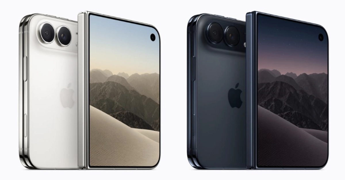
The Foldable iPhone: A New Era for iOS Layout
Apple today announced the iPhone Duo, its first foldable smartphone. While the hardware boasts a 5.4-inch external display and a 7.6-inch internal screen that unfolds, the real earthquake for developers lies beneath the surface. The iPhone Duo ships with iOS 27.x, a version that fundamentally redefines what an "iPhone screen" means. Assumptions about screen size, orientation, and safe areas, baked into iOS apps since 2007, are now obsolete. The core challenge: your app now exists in an environment with multiple, potentially changing displays and non-symmetric safe zones.
For developers who have diligently followed Apple's guidelines for adaptive and responsive layout, particularly for iPad applications, adapting to the iPhone Duo should be manageable. A focused afternoon of review and minor adjustments is likely all that's needed. However, apps that rely on hardcoded screen dimensions, fixed aspect ratios, or rigid orientation locking will require significant rework. The marketing highlights the hardware, but the developer story is about adapting to a fluid, multi-display reality.
Default Behavior: Running Without Changes
If you deploy an existing app to the iPhone Duo without any modifications, it will still run. It won't crash, and Apple is unlikely to pull it from the App Store based solely on this. However, the user experience will vary dramatically depending on the SDK version the app was last built against. Older applications, particularly those targeting pre-adaptive layout frameworks, will likely default to behaving as if they were running on a single, fixed-size screen. This could mean the app only utilizes the external display, or perhaps a portion of the internal display, with significant unusable space around the edges. The system will attempt to provide a consistent, albeit potentially suboptimal, experience. This fallback behavior underscores the critical need for developers to proactively address the new display paradigms.
Adaptive Layout: The Path Forward
The key to a successful iPhone Duo experience lies in embracing Apple's modern layout systems. Auto Layout, Size Classes, and SwiftUI are designed to handle varying screen sizes and states. For developers accustomed to building for iPad, the principles are familiar. The primary shift is the dynamic nature of the iPhone Duo's display. An app might start on the external 5.4-inch screen and then seamlessly transition to the larger, 7.6-inch internal display as the device is unfolded. This transition requires your layout to adapt in real-time. Consider an app displaying a list on the external screen; when unfolded, the same app could present a master-detail view on the larger internal screen.
Safe Area Insets: A New Paradigm
The concept of the "safe area" has evolved. On the iPhone Duo, the safe area is no longer a uniform margin around the screen. When the device is folded, it behaves much like a standard iPhone. However, when unfolded, the hinge introduces a new physical boundary. The system will provide distinct safe area insets for the internal display, accounting for the hinge and potentially other hardware elements. Apps must query and respect these insets to ensure crucial UI elements, like navigation bars, tab bars, and interactive controls, are not obscured or rendered in a physically awkward position. This means developers can no longer assume a symmetric safe area. What was previously a simple matter of avoiding the notch or home indicator now involves understanding a more complex physical layout. Imagine a video player that needs to avoid the hinge area, or a game that uses the entire unfolded screen but must keep critical buttons within the user's reach on the active display segment.

Handling Orientation and Multiple Displays
The traditional understanding of "portrait only" or "landscape" orientations is also complicated by the iPhone Duo. An app might be in a portrait orientation on the external screen but become a wider, landscape-like view when unfolded internally. The system will report the current display's geometry, but developers need to design for a state where the app can fluidly transition between these configurations. This isn't just about rotating the device; it's about the device's physical state changing the available screen real estate and aspect ratio. For instance, a messaging app could show a conversation list on one side of the internal display and the message input field on the other, effectively creating a split-pane view that isn't tied to a traditional landscape mode. If your app previously used `UIDevice.current.orientation` or relied on fixed `UIInterfaceOrientationMask` settings, you will need to pivot to using `UIScreen` and `UIView.safeAreaLayoutGuide` properties more dynamically.
SwiftUI and UIKit Strategies
For applications built with SwiftUI, adapting to the iPhone Duo is generally more straightforward. SwiftUI's declarative nature and inherent support for dynamic type, adaptive layouts, and state management make it well-suited for foldable devices. Using `GeometryReader`, `HStack`, `VStack`, and `LazyVGrid` allows for layouts that automatically adjust to available space. Developers should leverage `EnvironmentValues` to detect device state changes and adjust UI accordingly. For example, a `View` could conditionally render different layouts based on the reported size of the main screen.
For UIKit applications, the transition requires a more deliberate approach. Developers must ensure they are using Auto Layout correctly with appropriate constraints. `UIUserInterfaceIdiom.pad` size classes, even when targeting the iPhone Duo's internal screen, can be a useful starting point. The `UISplitViewController` can be adapted to manage master-detail interfaces across the two potential screen states. Crucially, developers need to actively monitor `traitCollectionDidChange` or use `UIView.layoutSubviews()` to react to changes in the view hierarchy's size and safe areas. The `UIScreen.main.bounds` and `UIScreen.main.nativeBounds` will provide information about the physical display, while `UIView.safeAreaInsets` will dictate where content can be safely placed. The key is to move away from fixed-frame positioning and embrace constraint-based, adaptable UI construction.

The Unanswered Question: App Continuity Across Fold/Unfold
While Apple has outlined the technical shifts required, what remains unaddressed is the precise user experience of app continuity during the fold/unfold transition. Will the system automatically manage app state and layout transitions perfectly, or will developers need to implement custom logic to ensure a seamless handover? For instance, if a user is typing in a text field on the external screen and then unfolds the device, will the cursor remain in place, and will the keyboard automatically adjust its position and size for the larger internal display? The success of the iPhone Duo hinges not just on developers adapting their code, but on the operating system's ability to provide an invisible, instantaneous transition that preserves user context and workflow. The current guidance focuses on reactive adaptation; the missing piece is proactive state management during these dramatic physical changes.
Conclusion: Embrace Fluidity
The iPhone Duo is more than just a new form factor; it's a catalyst for rethinking iOS app architecture. Developers who have already invested in adaptive and responsive design principles will find the path clearer. Those who haven't must now embark on a journey to decouple their UIs from fixed screen dimensions and static orientations. By leveraging SwiftUI's declarative power or meticulously applying Auto Layout and dynamic trait management in UIKit, developers can ensure their applications not only run but thrive on Apple's first foldable device. The era of the single, immutable iPhone screen is over. The future is fluid, multi-display, and demands layouts that can bend, stretch, and transform as gracefully as the hardware itself.