The Ubiquitous Problem of Cutoffs
Every data analysis, from the simplest user segmentation to the most complex scientific study, eventually confronts the same quiet but critical decision: where do you draw the line? This isn't about choosing a threshold for a binary classification; it's about defining what constitutes a meaningful unit for analysis. How many reviews must a product receive before its average rating is considered trustworthy? How many purchases signify an "active" customer? How many times must an artist appear on a chart before they are deemed "known" in a given genre?
These seemingly minor decisions are anything but. The cutoffs you select propagate downstream, shaping every subsequent result, conclusion, and recommendation. An amateur might pick a number that "feels right" – a round figure like 100 reviews or 10 purchases – based on intuition or convenience. A professional, however, understands that the true measure of their work lies not in the number they pick, but in their ability to defend it. This guide explores how to move from arbitrary choices to defensible, data-driven thresholds.
Two Paths to Thresholds: Intuition vs. Data
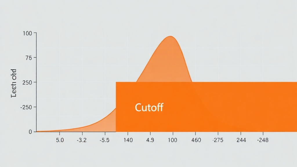
The first method for setting a cutoff is the "it feels right" approach. You might say, "Let's set the minimum to 100 reviews." It's a round number, it sounds reasonable, and it takes mere seconds to decide. This method is quick and requires minimal effort. However, it often lacks any empirical basis, making it difficult to justify when challenged.
The second method involves asking the data itself. This requires a more rigorous process. You measure how your data values actually distribute. Then, you systematically evaluate candidate cutoffs: for each potential threshold, you count how many data points it keeps and how many it discards. The goal is to choose the cutoff whose meaning, when articulated, accurately reflects what you are trying to capture or define. This isn't about finding a perfect number, but finding a number that serves your analytical purpose demonstrably.
The Tyranny of the Arbitrary Floor
A common pitfall when setting thresholds is the tendency to create arbitrary floors that can distort results. Imagine you are analyzing the performance of songs on a streaming platform. You want to identify "popular" songs. If you set a cutoff of, say, 1,000 streams, you might exclude many songs that have a small but dedicated following, or songs that are new but showing rapid growth. Conversely, if your cutoff is too low, you might include noise – songs with only a few accidental plays.
The issue is compounded when the distribution of your data is highly skewed. Many datasets, especially in online platforms, exhibit a power-law distribution, often called a "long tail." This means a few items have extremely high values (e.g., blockbuster movies, viral songs), while the vast majority have very low values. If you set an arbitrary cutoff, you might end up with:
- Too much noise: If the cutoff is too low, you include many items with negligible impact, making it hard to discern genuine trends.
- Too much exclusion: If the cutoff is too high, you might miss emerging artists or niche successes that are important for understanding the full landscape.
- Statistical artifacts: A poorly chosen cutoff can create artificial breaks in your data, leading to misleading conclusions about performance or engagement.
This is where a data-driven approach becomes essential. Instead of guessing, you analyze the distribution to understand where natural breaks or meaningful clusters occur.
Method 1: The Cumulative Distribution Function (CDF)
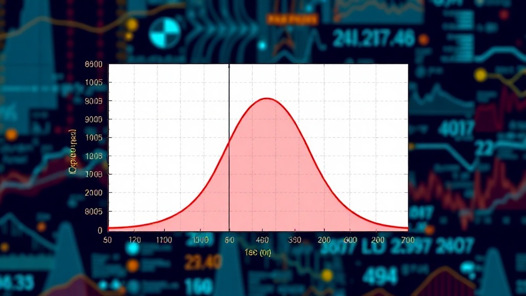
One powerful statistical tool for determining defensible cutoffs is the Cumulative Distribution Function (CDF). The CDF plots the proportion of data points that fall below a particular value. For a given variable (e.g., number of reviews, purchase frequency), the CDF shows, for any value X, the percentage of observations less than or equal to X.
To use the CDF for setting a cutoff:
- Gather your data: Collect the relevant metric for all items you are analyzing (e.g., review counts for all products).
- Calculate the CDF: Plot the CDF of this data. This will typically show an S-shaped curve.
- Identify inflection points: Look for points on the curve where the slope changes significantly. A sharp increase in the slope might indicate a point where a substantial number of new items are included with only a small increase in the cutoff value. Conversely, a flattening of the curve might suggest a point where adding more items captures only those with very few occurrences.
- Consider the meaning: Choose a cutoff value that corresponds to a meaningful point on the CDF. For example, if you want to identify the top 80% of products by review count, you find the value on the x-axis where the CDF reaches 0.8. If you want to identify products with *more* reviews than 90% of all products, you find the value where the CDF is 0.9.
This method provides a statistical anchor. You can say, "We've chosen 150 reviews as our cutoff because this includes the top 75% of products by review count, effectively filtering out the long tail of infrequently reviewed items while retaining the vast majority of items with significant review history." This is far more defensible than simply stating "150 reviews feels right."
Method 2: Analyzing Group Sizes
Another practical approach involves directly examining how different cutoffs affect the size and composition of your analytical groups. This method is particularly useful when you have a specific hypothesis about what constitutes a meaningful group.
Here's how to implement it:
- Define your candidates: List several potential cutoff values based on initial exploration or domain knowledge. For example, if analyzing customer purchase frequency, candidate cutoffs might be 1 purchase, 3 purchases, 5 purchases, 10 purchases.
- Segment your data: For each candidate cutoff, segment your user base into two groups: those who meet the threshold and those who do not.
- Evaluate group characteristics: Analyze the characteristics of each group. For the "active" customer group (those meeting the cutoff), ask: What is their average lifetime value? What is their churn rate? What is their engagement level? For the "inactive" group, what are their characteristics?
- Compare and contrast: Compare the characteristics of the "active" group across different cutoffs. Does the average lifetime value increase dramatically when moving from 3 to 5 purchases? Does the churn rate drop significantly above 10 purchases?
- Select the optimal cutoff: Choose the cutoff where the "active" group exhibits the desired characteristics that distinguish them from the "inactive" group, and where the size of the "active" group is still substantial enough for meaningful analysis. For instance, if you find that customers making 5 or more purchases have a 3x higher LTV and a 50% lower churn rate than those making fewer, 5 purchases becomes a defensible cutoff for defining "high-value customers."
This method is transparent and directly links the cutoff decision to observable differences in user behavior or item characteristics. It’s akin to tuning a radio dial, adjusting the frequency until the clearest signal emerges.
Worked Example: Artist Popularity on a Music Platform
Let's apply these methods to determine what makes an artist "known" on a hypothetical music platform. Our data includes the number of times each artist's tracks have appeared in user-generated playlists.
Step 1: Data Exploration and Distribution
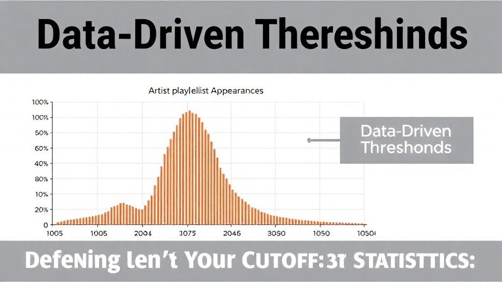
We collect playlist appearance counts for 10,000 artists. A histogram reveals a highly skewed distribution: most artists appear in very few playlists, while a small number appear in thousands.
Step 2: Using the CDF
We plot the CDF of playlist appearances. The curve rises sharply at low values and then flattens out considerably after around 500 appearances. We observe:
- The 50th percentile (median) is only 25 appearances.
- The 80th percentile is 150 appearances.
- The 95th percentile is 600 appearances.
If our goal is to identify artists with substantial reach, we might choose a cutoff around the 90th or 95th percentile. Let's consider 500 appearances. At this cutoff, we capture the top 5% of artists by playlist appearances. This is a defensible choice because it represents a clear statistical threshold capturing the most widely featured artists.
Step 3: Analyzing Group Sizes
Now, let's test candidate cutoffs using the group analysis method:
- Cutoff: 50 appearances. Group size: 20% of artists. Average track plays per artist: 5,000.
- Cutoff: 200 appearances. Group size: 10% of artists. Average track plays per artist: 25,000.
- Cutoff: 500 appearances. Group size: 5% of artists. Average track plays per artist: 80,000.
- Cutoff: 1000 appearances. Group size: 2% of artists. Average track plays per artist: 150,000.
We observe that moving from 200 to 500 appearances yields a substantial jump in average track plays, suggesting a qualitative difference in artist popularity. The group defined by 500+ appearances represents artists with demonstrably higher engagement. This makes 500 a strong candidate for our "known artist" cutoff. We can articulate this as: "We define a 'known artist' as one whose tracks appear in 500 or more playlists, representing the top 5% of artists and correlating with significantly higher overall track plays, indicating a distinct level of platform recognition."
Conclusion: From Guesswork to Justification
Picking cutoffs is an unavoidable part of data analysis. While intuition can offer starting points, it rarely provides justification. By employing statistical methods like analyzing CDFs or systematically evaluating group characteristics, you can move from arbitrary guesses to defensible thresholds. This not only strengthens the validity of your analysis but also builds trust in your findings, transforming a subjective choice into an objective, data-backed decision.